Modeling – 3D male head shape #2

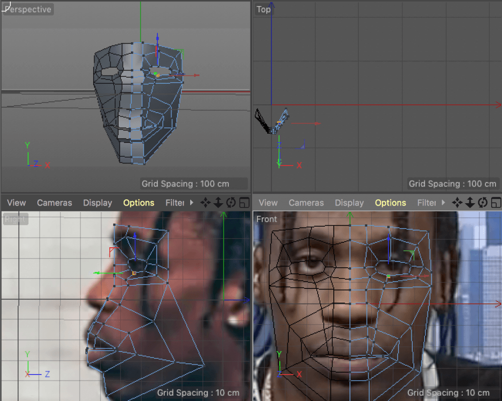
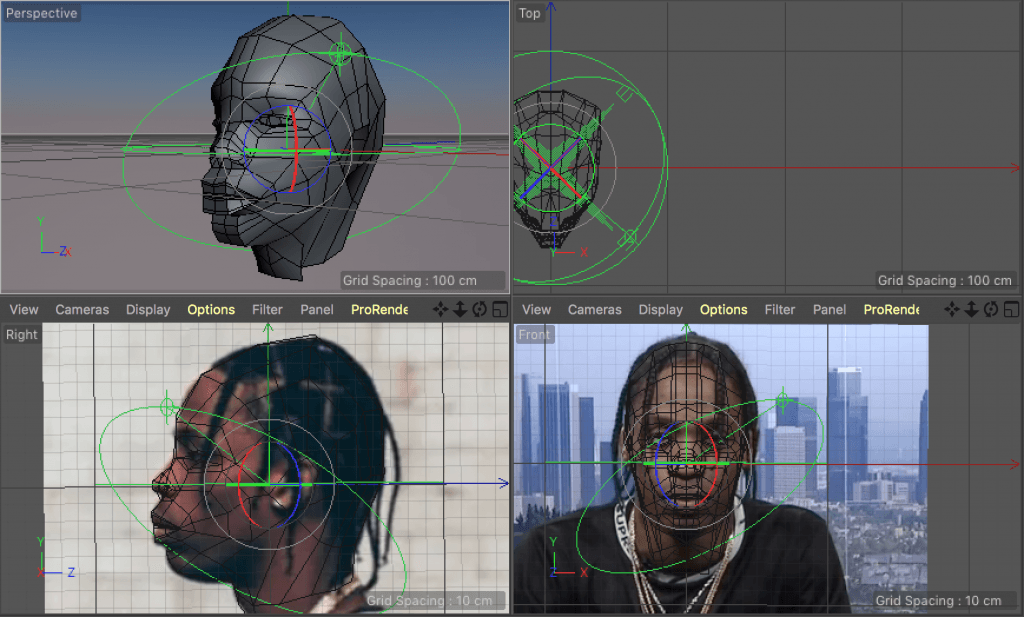
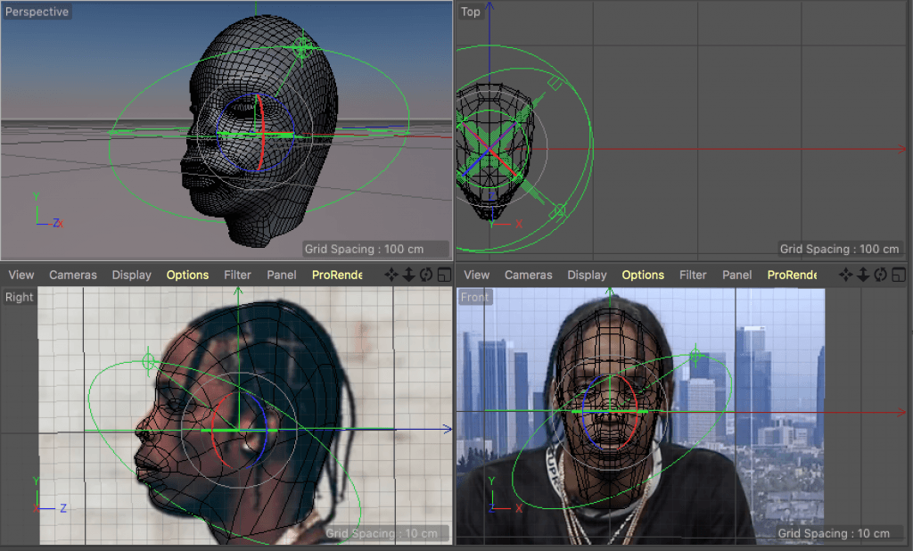
After the first attempt, I followed a different tutorial. This time I chose a YouTube video instead of a tutorial from a book. The main difference would structuring the model with a plain instead of a cube. Even though it was easier to follow, I still had some problems – the tutorial was designed for Blender, so I had to find tools in Cinema 4D, which replaced the Blender functions. For example, ‘Weld’ works like Blender’s ‘Merge’ and Symmetry tool works like ‘Mirror’. I also had a problem with  extrusions at points, but I used a ‘Knife’ tool instead and aligned the vertices accordingly.

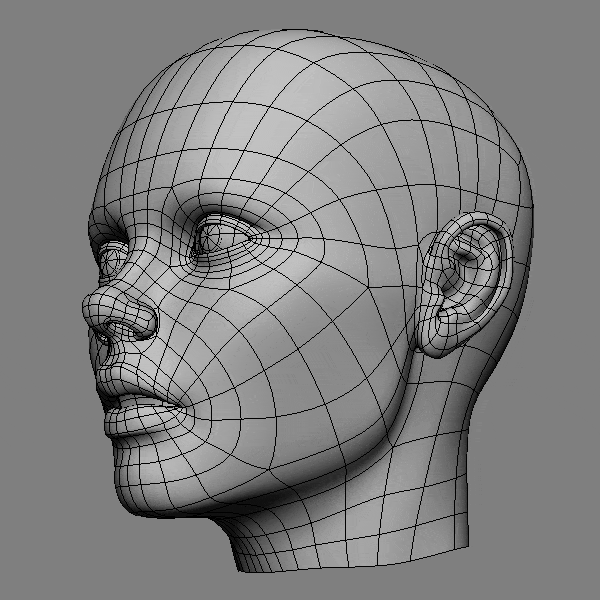
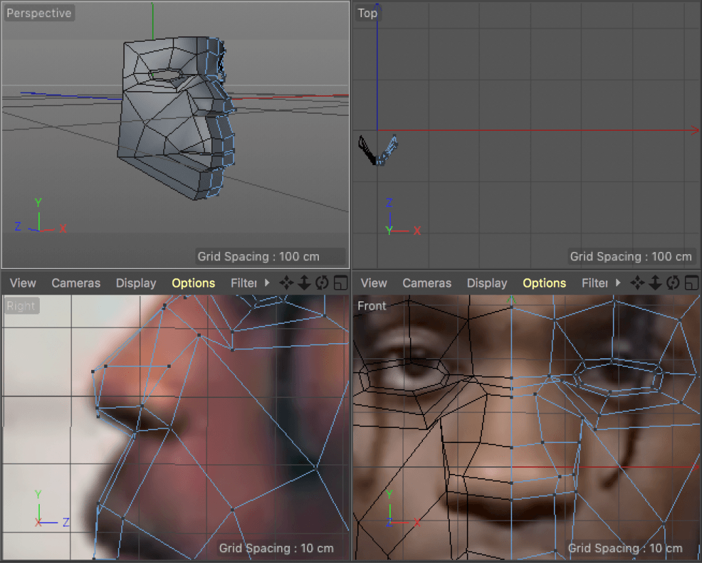
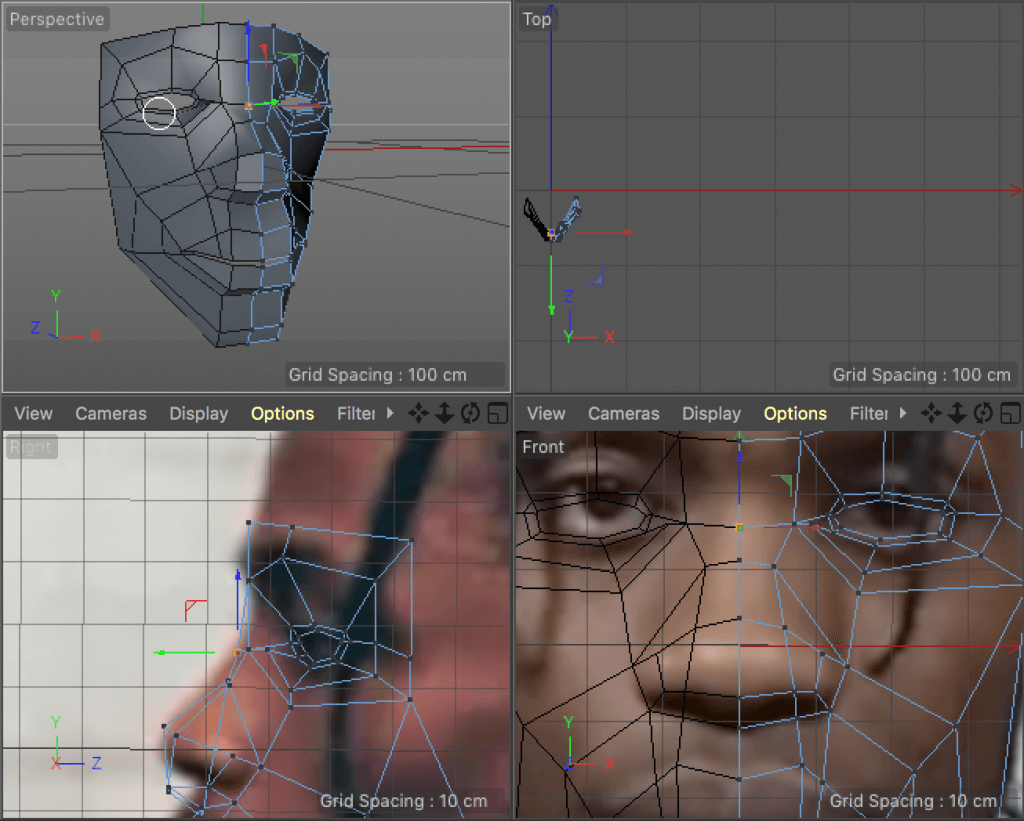
It is essential to operate in between side and front views. Aligning the points systematically helps to avoid a mess and keep the model clean. Another important thing I’ve learned are the rules of good topology around the mouth, nose and the eyes:

topology

Good topology provides accurate model after applying Subdivision Surface, which smoothens the mesh.

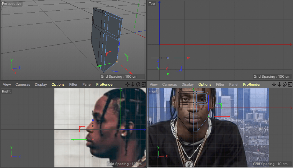
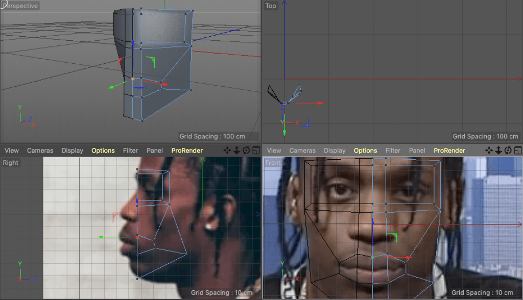
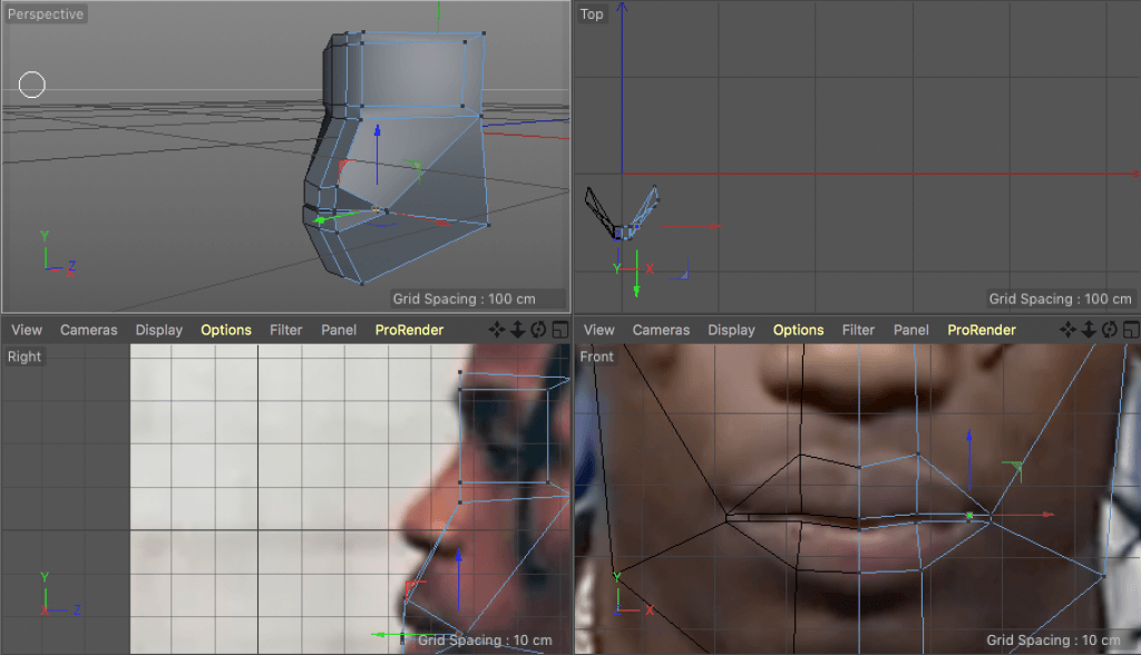
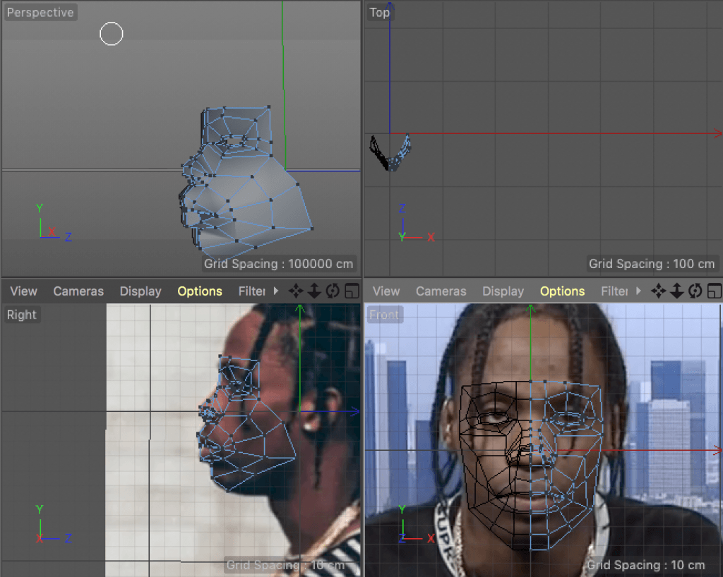
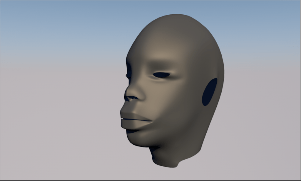
In the last post I mentioned the non-planar polygons. I learned that it is basically impossible to create a human head model without spreading some points apart from a single plain. Although, it is not a big issue when Subdivision Surface is applied, as it fixes incorrect shadows. Here’s the process of my second approach and the result in progress:

Zrzut ekranu 2018-02-17 o 19.04.09 Zrzut ekranu 2018-02-17 o 19.22.54 Zrzut ekranu 2018-02-17 o 19.47.29 Zrzut ekranu 2018-02-17 o 20.11.00 Zrzut ekranu 2018-02-17 o 20.28.56 Zrzut ekranu 2018-02-17 o 20.36.40 Zrzut ekranu 2018-02-17 o 21.13.23 Zrzut ekranu 2018-02-17 o 22.49.17 Zrzut ekranu 2018-02-17 o 22.49.29 Zrzut ekranu 2018-02-17 o 22.49.41

This mesh obviously hasn’t been finished and I will keep developing this model. The complicated process could result in too much work over a few models. What my tutor suggested was focusing on just one artist, but mastering the models and the composition. I’m yet to decide how to approach it, but it seems like a good solution.

Here’s the video I’ve used for this model:


Modeling – 3D male head shape #1

The first step into creating my compositions will be approaching potentially the most complex structure in the whole design – human head. Regardless of how the final images will look like, creating it will be a necessity. This is why I will continue on expanding ideas throughout this process, while preparing assets that I need for my project.

I have found a very useful tutorial in one of the 3D modeling books and decided to follow it along. I’ve managed to create a rough version of what the mesh could look like in the end, but there have been many errors and mistakes I’ve made, which taught me a lot. First of all, one step involved preparing just half of a cube for the head model. I had to fix a gap resulting in the removal of half of the object. The most common tool called Bridge didn’t seem to resolve the situation, as it didn’t “glue” the mesh together properly. I found in the internet that there’s an option called “Mesh Checking” which highlights any possible mistakes and bad geometry. It showed 2 green lines, which haven’t been connected with the object properly, so I looked for alternative solutions. One of them is a simple tool called “Close Polygon Hole” and it worked perfectly, fixing my first issue. Image below presents the problem (highlighted green lines):

 Zrzut ekranu 2018-02-10 o 15.34.18

I then carried on with following the tutorial and creating the basic shape from a cube:

Zrzut ekranu 2018-02-10 o 14.42.11 Zrzut ekranu 2018-02-10 o 19.53.49 Zrzut ekranu 2018-02-10 o 20.28.38

At this stage I realized that the images aren’t perfectly responding to the perspective I needed, as they were’t perfectly aligned. I replaced the images with better ones and adjusted the geometry accordingly.

Zrzut ekranu 2018-02-10 o 21.31.11

I noticed a critical error after finishing the touch-ups. Using the Mesh Checking tool I discovered that most of the model is highlighted with bright red. It was the area with non-planar polygons. Those aren’t consisting of points on the same plane, which could result in odd shadows and additional artifacts. It’s not a big issue when Subdivision Surface is being applied, but I can’t exclude an option of operating on a raw model. One last problem I encountered was not centering points of the half of the face with the Y axis. After applying symmetry effector it didn’t align perfectly.

Even though it wasn’t entirely successful, this process taught me a lot and the second approach should be more promising.

Zrzut ekranu 2018-02-10 o 22.20.31 Zrzut ekranu 2018-02-10 o 22.34.29Zrzut ekranu 2018-02-11 o 12.17.41

Revision of Photoshop blending modes

I recently came across a tutorial, which in detail explained how the blending modes work in Adobe Photoshop. I thought it could be very useful when it comes to retouching the images that I will be going to prepare. Thus, I will briefly outline each of the blending modes in this article.

First of all, there are 27 blending modes divided into 6 categories:

Zrzut ekranu 2018-02-09 o 16.04.51

Opacity and Fill give the same results in case of 19 out of 27 blending modes. Below, the 8 special blending modes which give different results when Opacity and Fill are being modified have been highlighted:

Zrzut ekranu 2018-02-09 o 16.17.52

Useful shortcut: Shift +/ Shift – for switching between the blending modes.

Dissolve – at 100% opacity it’s the same, but as you lower it, it makes the image scattered

Darken – white becomes invisible, anything darker than white is going to have some darkening effect to the pixels below it

Multiply – multiplies the luminosity of the base colour (layer) by the blend colour (layer above)

Colour Burn – reacts differently when opacity is adjusted compared to fill -> more highly saturated mid-tones and reduced highlights

Linear Burn – decreases the brightness of the base colour based on the value of the blend colour. The result is darker than multiply but less saturated than Colour Burn. Produces the most contrast in darker colours than any of the other blending modes in the “Darken” group

Darker Colour – similar to darken. It does not blend pixels. It compares the base and blend colours and keeps the darkest of the two. The difference is that Darker Colour looks at the composite of all RGB channels whereas Darken looks at each individual RGB channel

Lighten group are the opposites of the Darken section.

Screen – multiplies the inverse of the blend and base colours. The result colour is always a brighter colour

Colour Dodge – Opacity and Fill will give different results. It gives a brighter result than Screen by decreasing the contrast between the base and blend colours resulting in saturated mid-tones and blown up highlights

Linear Dodge – similar but stronger than Screen or Colour Dodge

Lighter Colour – compares base and blend and keeps the brightest of the two (looks at all RGB channels in total)

Contrast category -> Photoshop checks to see if the colours are darker than 50% grey (darkening blending mode) or lighter than 50% grey (brightening blending mode). With the exception of Hard Mix, all blending modes in this category turn 50% grey transparent

Overlay – Multiply + Screen – base layer always shining through – makes calculation based on the base layer but not the blend layer

Hard Light – intense results (in many cases Opacity has to be reduced for better results)

Soft Light – like Overlay, but softer (no harsh contrast)

Vivid Light – extreme version of Overlay and Soft Light (you want to adjust Opacity and Fill)

Linear Light – uses a combination of Linear Dodge blending on lighter pixels and Linear Burn on darker pixels

Pin Light – Darken and Lighten simultaneously

Hard Mix – loss of detail (tweak Opacity and Fill)

Difference – inverts colour for white – doesn’t affect black (tweak Fill and Opacity)

Exclusion – similar to Difference

Subtract – subtracts pixel values from the base layer. Drastically darkens pixels

Divide – opposite effect to Subtract

Hue – preserves the luminosity and saturation of the base pixels while adopting the hue of the blend pixels

Saturation – preserves the luminosity and hue of the base layer while adopting the saturation of the blend layer

Colour – preserves the luminosity of the base layer while adopting hue and saturation of the blend layer. You will get the same result when applying to the blend layer as if you applied Luminosity to the base layer and then reveres the order of the layers

Colour correction and colour toning with Luminosity blend layer with the black and white adjustment layer:

1. Create a new black and white adjustment layer

2. Int the properties panel you can adjust the luminosity of the original colours by dragging the sliders

3. Change the adjustment’s layer blending mode to Luminosity, it will get the colours back.

4. Now use sliders (adjust the luminosity but keep the colours)

Project 2 Outline

My second term project will be strongly related to my initial idea and based around further 3D modeling skills development and graphic design. I’m going to continue the concept of 3D head models and features distinctive to the most relevant Hip-Hop artists. After completing the main task of creating the compositions in Cinema 4D and Adobe Photoshop, I will assemble them in a form of a magazine issue, revising Adobe InDesign tools.

I chose the Development strand again, as I will still need to develop my skills. Although, unlike it was in the previous term, I will put more emphasis on the final product rather than just learning.

I will also consider all points made by my tutor in the first term work review. Some of the most important improvements:

– bigger emphasis on primary sources

– outputs need contextualising and evaluating against the industry in which they sit

– consider creating a timelapse video or more tutorial in nature

– greater amount of developed output to support the original and overarching intent for the project

– it might help to seek external critique of my work in order to gain a clearer picture of how the artefacts I have produced stand up to industry scrutiny

Outstanding task: Photoshop compositing

While closing up this term, I still have an outstanding on my Scholr page. I was supposed to revisit Adobe live streams focused on Photoshop compositing with Mike Campau and a few other artists. This task is important, but as I was really concentrated on 3D modeling skills in the past weeks, I decided to leave it out till it comes to creating actual compositions with finished models. If I went through hours of tutorials now, I would most likely forget some of the useful advice and tips by the time I’m assembling my work in the next semester.

In my spare time, I still create some work within Photoshop, which means that I constantly practice some of the skills.

Here are the videos that I will go through in the next term: