Final piece for submission: complete breakdown

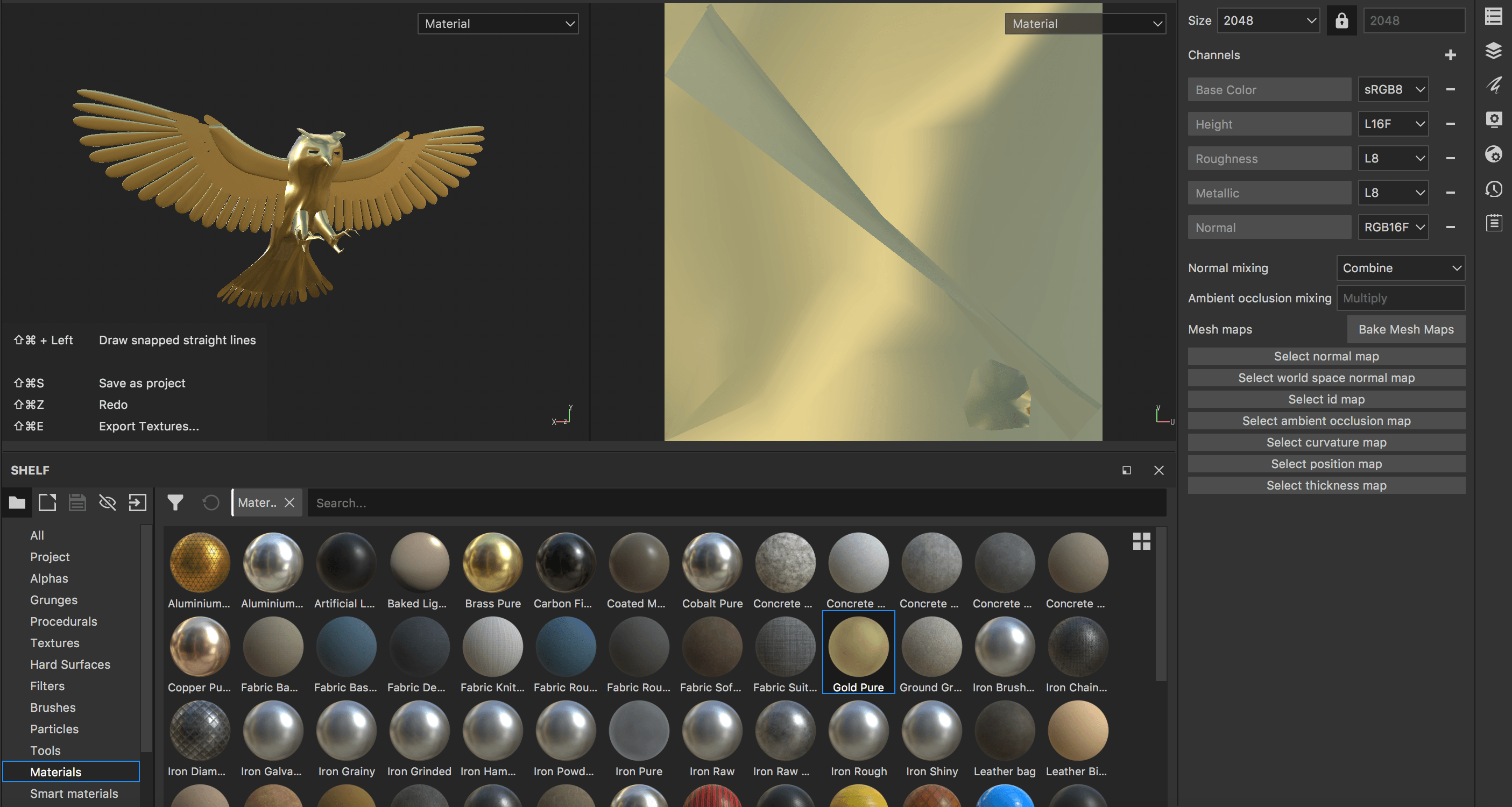
Having all models ready for the material application and rendering, I came to the very final stage of my project. I played around with the Substance Painter materials to see what works best. As planned initially, the whole scene that I have set up had a dark vibe. The material that I presented in my EPK piece didn’t seem to work very well with the dark background. Also, that material did not have enough of effective glossiness, which would interact with the light. Having tried almost every material, I came to a conclusion that pure gold had a very promising  contrast with black. Normally, these two colours are used in design for the creation of elegancy or upper class sense. I thought that it is a good idea to go with and call my set of images “The Golden Era”. Not only relating to the aesthetic, but also the upcoming of the artist that this project is about. I took a slightly different path to what I planned as “On the Way to Astroworld”, but it resulted in a better concept.

Zrzut ekranu 2018-04-27 o 12.07.32

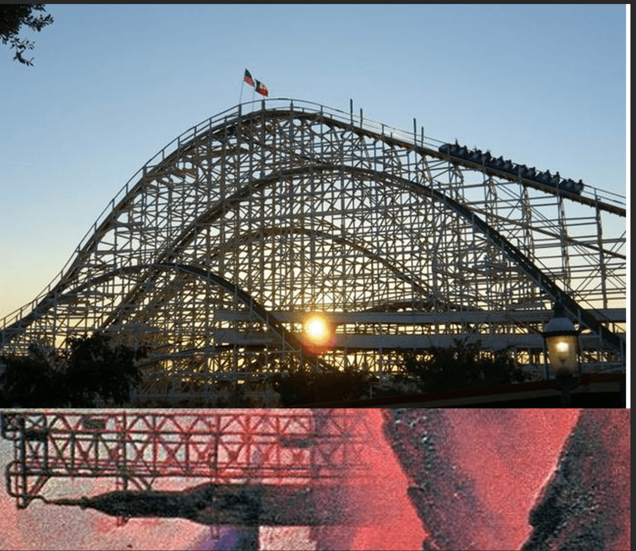
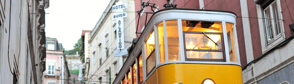
Recently, I have been revising some tutorials about light and found a great solution for my project: single volumetric light. The idea is, visible light with a dusty texture to it looks great when contrasting with darkness. An inspiration for this idea was an image, which I have come across during the final stages of planning the design:

2ab7e6ea829dc9aff57225176255efc0

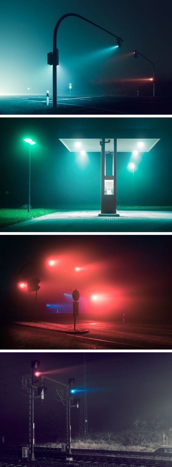
These lights in the streets made me realize that they will set the perfect mood for the imagery. After all, Travis Scott produces dark, eerie melodies, which perfectly represent this kind of aesthetic.

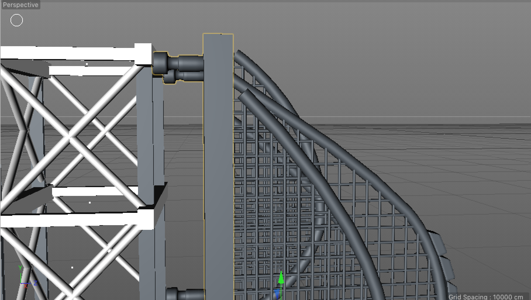
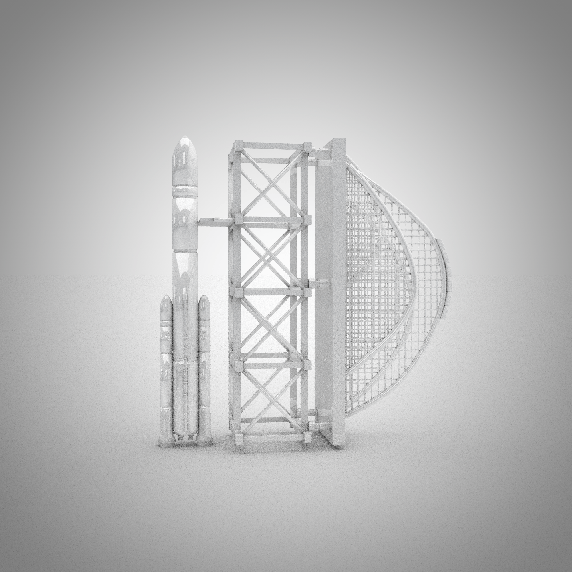
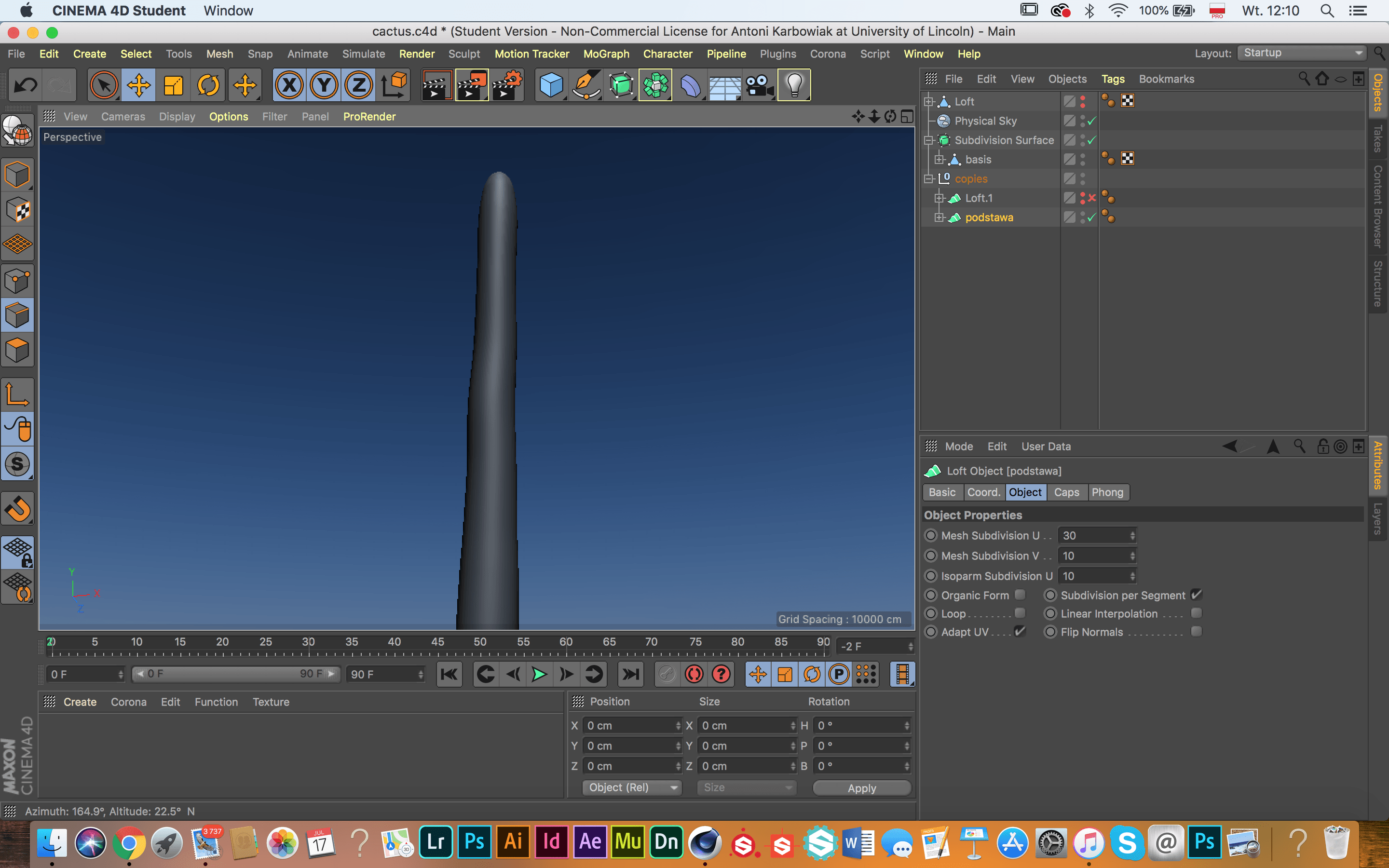
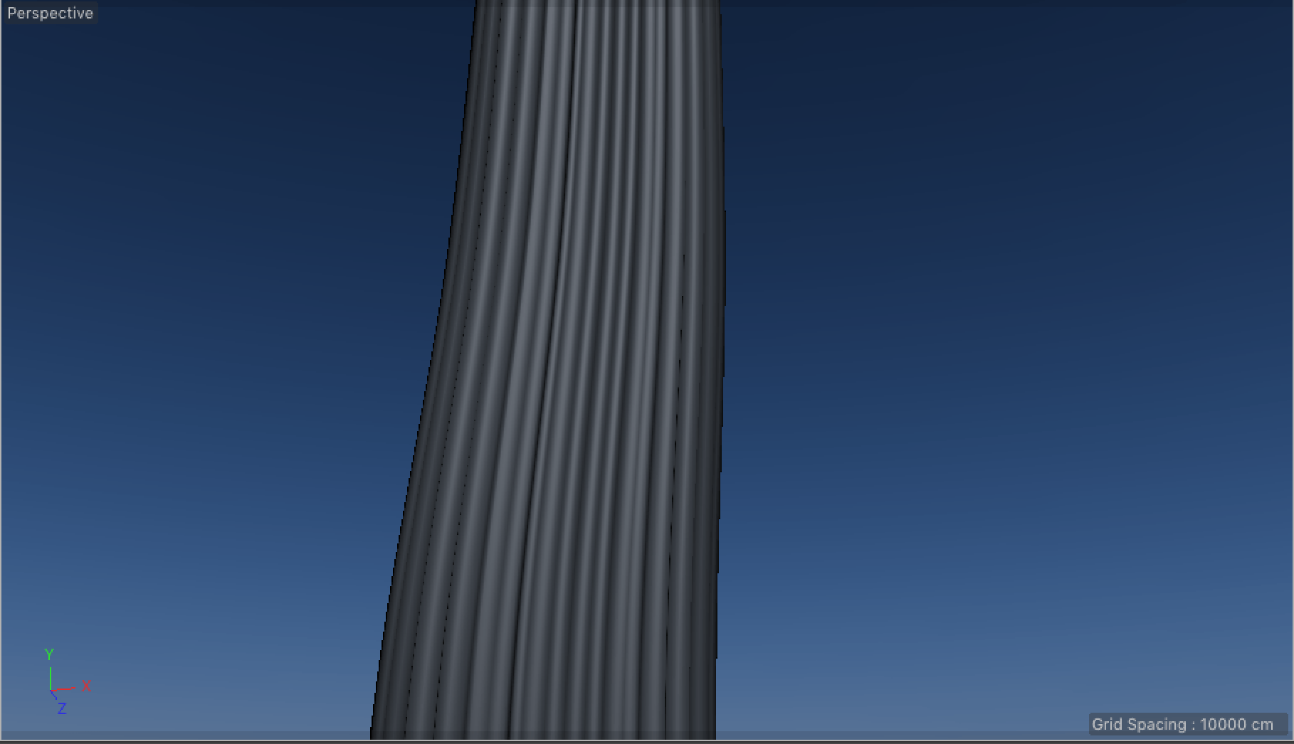
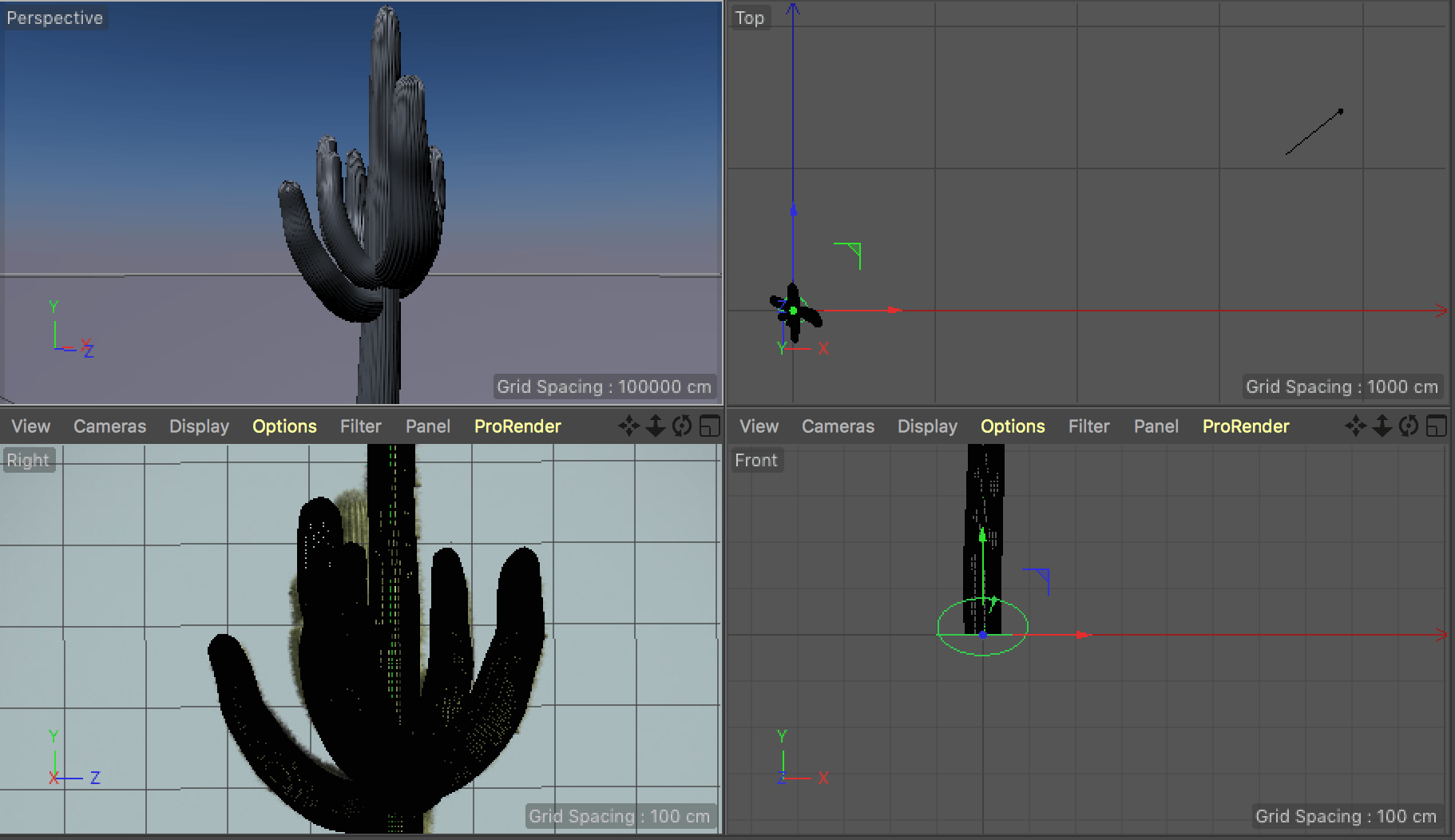
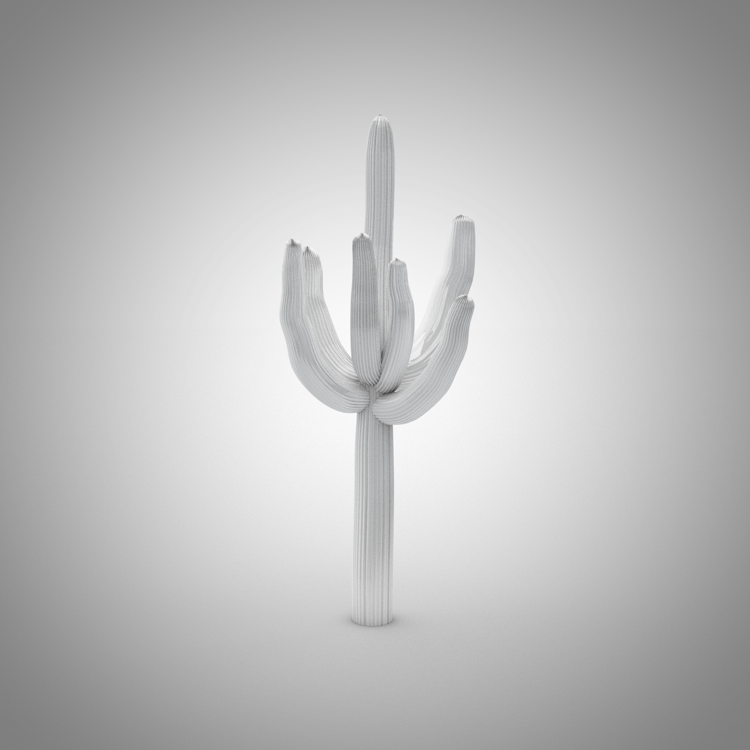
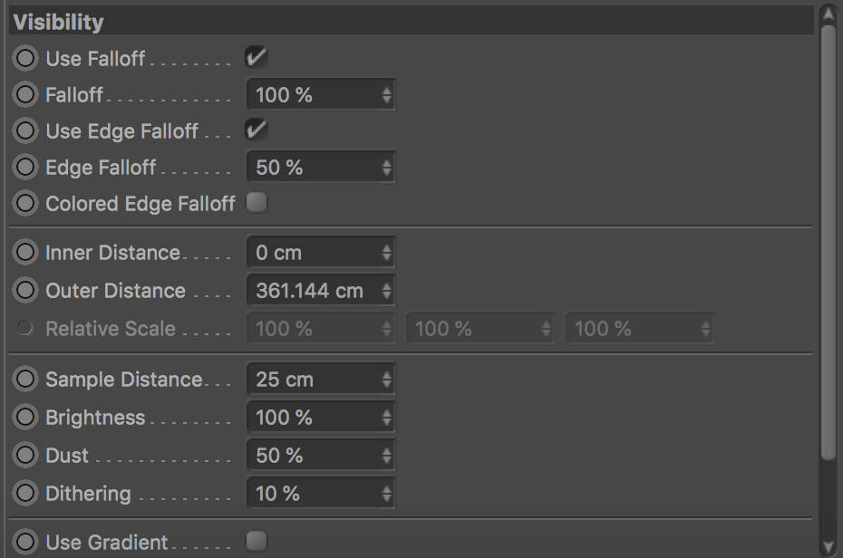
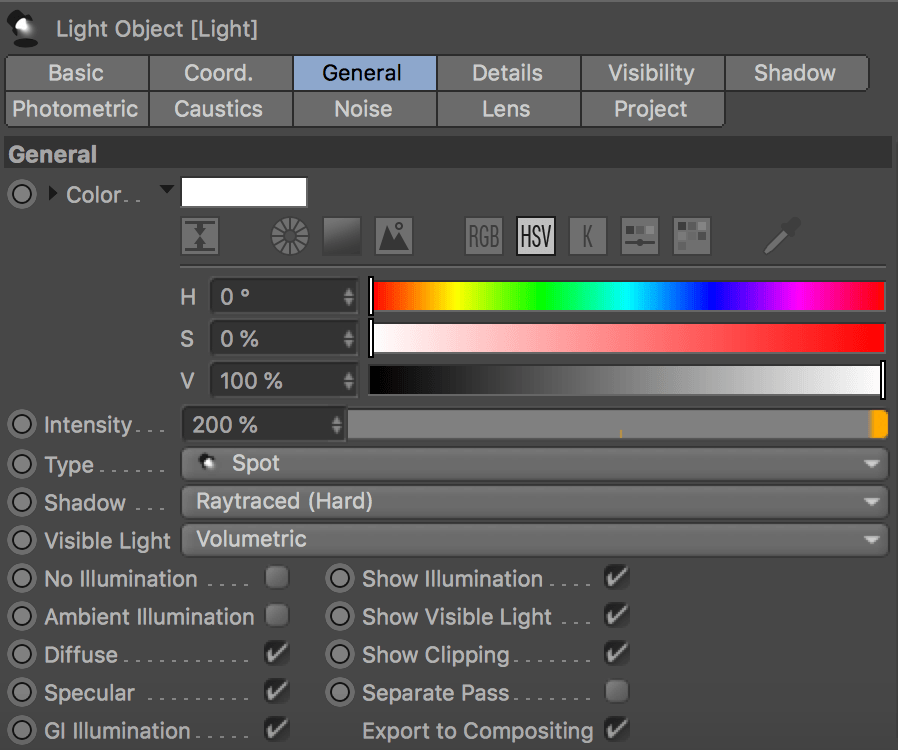
I wanted to express the knowledge about rendering principles and light that I have gained throughout this term. The objects I have designed obviously aren’t meant to convey realism, but the surrounding and lighting are. Before placing the models, I have built a scene, which would be the same for every image, although the angles of the renders would vary. The scene construction is quite simple, but effective. It consists of the aforementioned volumetric light, a stage with a black gloss material and the model itself. Although, the crucial element are the render settings, which result in the realistic outcome.

Zrzut ekranu 2018-04-27 o 12.22.04Zrzut ekranu 2018-04-27 o 12.28.02Zrzut ekranu 2018-04-27 o 12.29.49

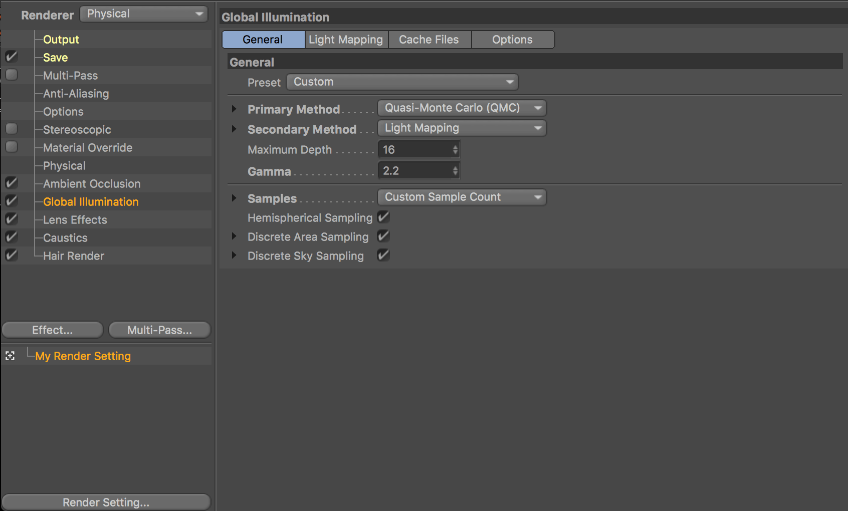
The combination of primary and secondary methods, being Quasi-Monte Carlo and Light Mapping resulted in extremely long render times. Additionally, caustics and ambient occlusion extended the render time, which peaked at 2 hours in case of one of the images. Another reason for it was the export setting, being over 2k of resolution in 300 DPI. The last reason for an exhaustive render time was the light setting. The visibility, adjusted shadows, dust samples, noise and glow required more complex calculations.

Zrzut ekranu 2018-04-27 o 12.39.48 Zrzut ekranu 2018-04-27 o 12.39.40

The format of the images was meant to be adjusted for the article for print, which was the concept explained earlier in the development stage. Nevertheless, I decided to only focus on the refinement of the images and modeling methods. My other module, Creative Industries Case Study required a complex design of a PDF document. This way, I had a great revision of Adobe InDesign and made the whole document. It wasn’t essential to come back to this piece for software anymore, and let me focus on what really mattered – the quality of the images.

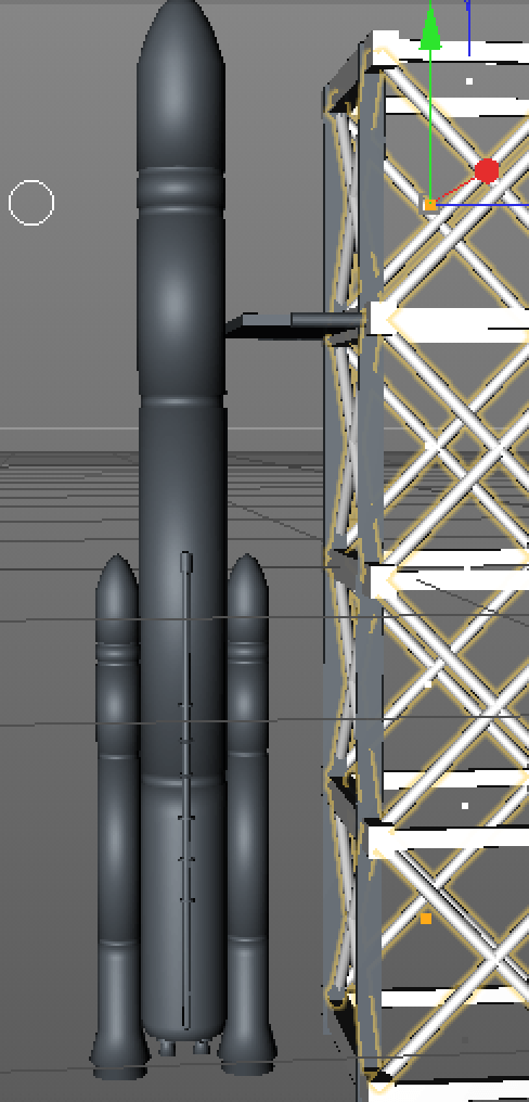
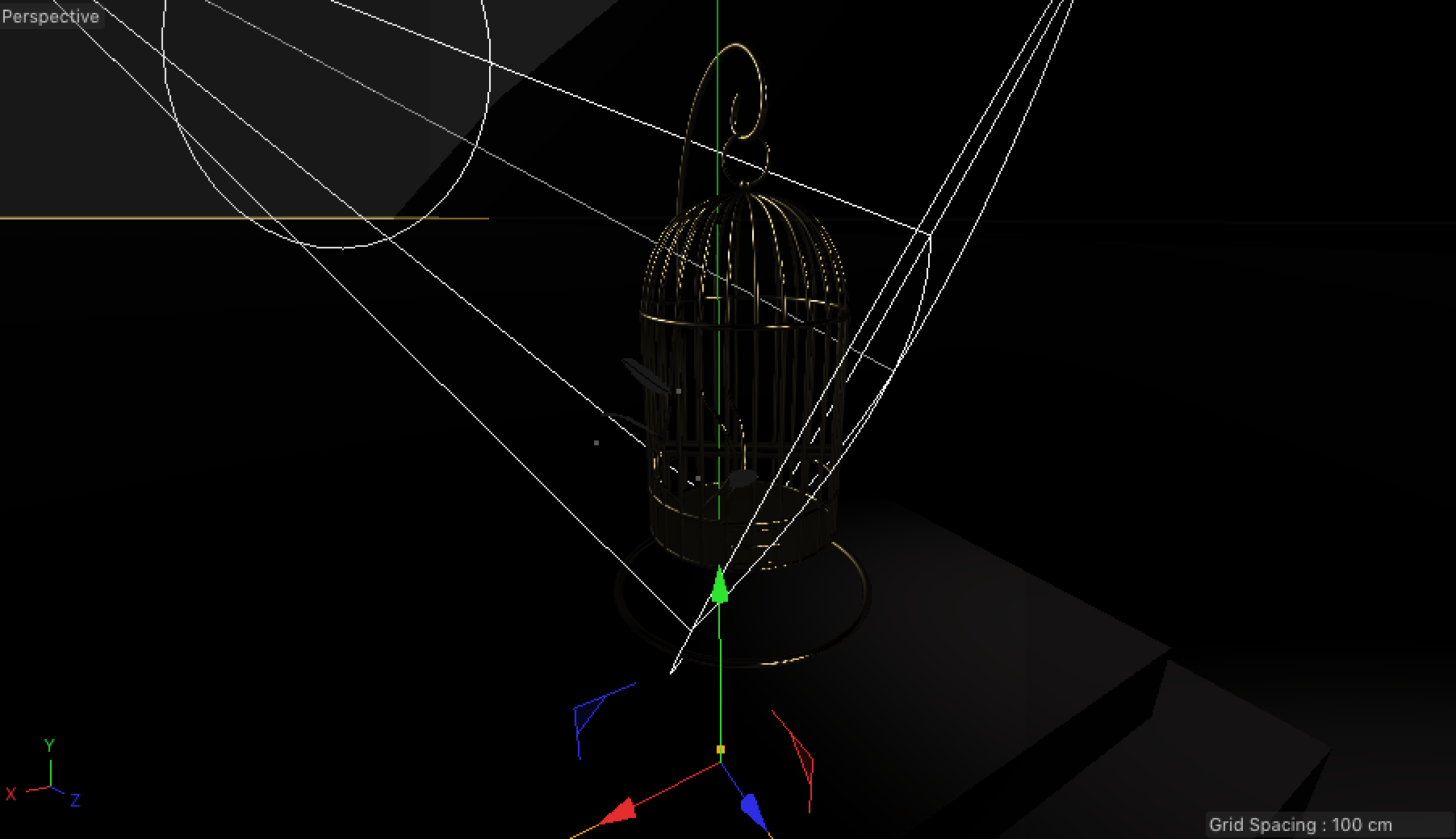
After preparing the scene, I placed the objects, choosing the right camera angle and started rendering.

Zrzut ekranu 2018-04-27 o 12.37.12

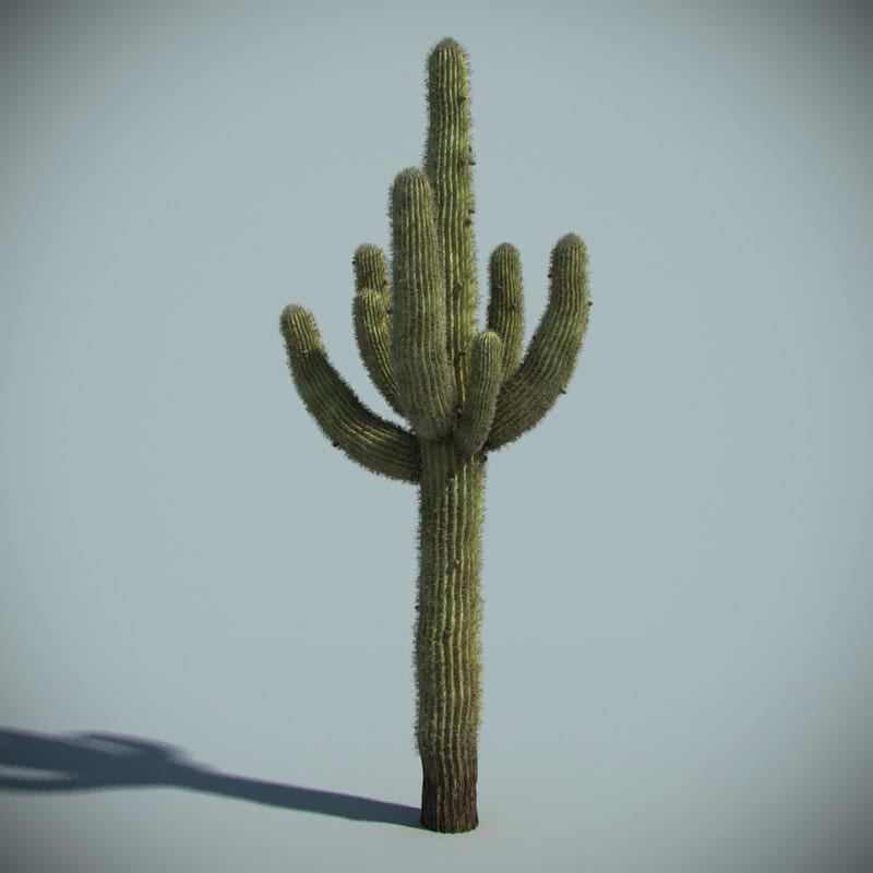
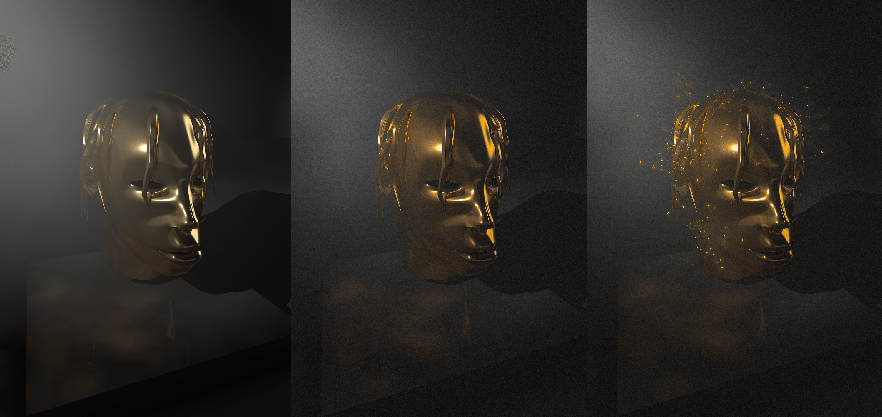
The renders have then been edited in Lightroom, leading up to a more vintage/distinctive look. In Photoshop, I have added an element of the emissive light, by gold dust particles, copying the layer, lowering its opacity and moving the whole layer to the right (distorted look), and painting underneath the particles with a golden brush, set to 0% roughness and flow to 1%. I do not really use the “outer glow” effect, as this way I have more creative freedom and  precise dimensions. Below, I have prepared a breakdown of each of the stages, 1. original render, 2. post- Lightroom 3. Photoshop and particles.

breakdown

In case of the cactus image, I have added an additional effect. I simply used flame brushes, but some of them needed an additional layer mask, because the basis did not connect well with the tips of the cactus arms. This idea relates to Travis Scott’s label, Cactus Jack, and the symbol of a burning cactus that he consistently uses in his merchandise.

sumup

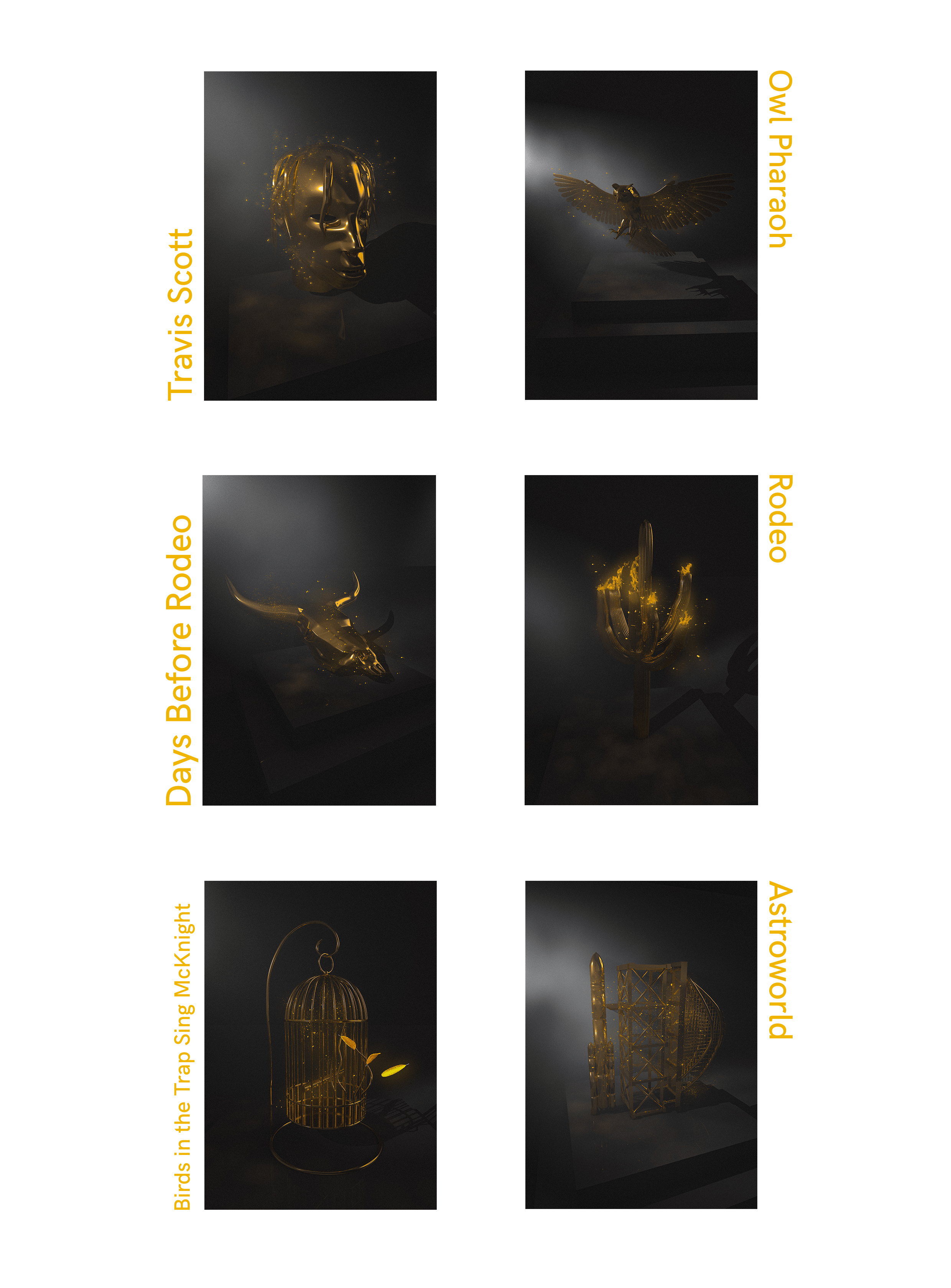
I am really happy with the final outcomes of this project. It made me complete every single aim that I have set at the very beginning of the third year. Consistent learning process and the application of corrections + developments resulted in a high quality content.

Chapter 5: Astroworld

This stage was dedicated to an upcoming album, which is the most anticipated project ever coming from Travis Scott. Artists like Kanye West and the legendary producer Mike Dean are heavily involved in this piece. It will most likely also feature surprise artists  like Tame Impala and Stevie Wonder.

It took me a very long time to decide what will be the main subject of this composition. The title “Astroworld” relates to an amusement park in Houston, which Travis Scott attended as a kid. It was then closed and became an inspiration for his new album title.

Firstly, I was planning to make an image of a planet and a rollercoaster going through it. One of the possible looks of it was suggested by my tutor – he mentioned a logo used in the game titled Planet Coaster:

Zrzut ekranu 2018-04-25 o 20.12.40

When I was coming to the final stages of planning, I came across two images together – a space rocket about to be launched and the actual Astroworld rollercoaster. I liked how similar the metal installations looked and decided to put them together as one model. To have a good reference, I quickly put these two photos together in Photoshop, to then open it in C4D:

Zrzut ekranu 2018-04-25 o 00.32.36

The theme park side of the model was quite time consuming. I was trying to find a way to simply repeat the pattern of the metal bars and somehow make the rails a boundary, where it stops. Eventually, I just did it manually, by making the rails a simple sweep consisting of a pen tool-made spline and a circle as the shape.

Zrzut ekranu 2018-04-25 o 20.19.50 Zrzut ekranu 2018-04-25 o 20.19.20

I then moved onto connecting the space rocket structure with the rollercoaster. It is a combination of simple shapes, but I also used the cloner effector, which made the process much quicker and more precise.

Zrzut ekranu 2018-04-25 o 20.28.46 Zrzut ekranu 2018-04-25 o 20.28.26

The last stage was making an actual rocket. For this part, I once again used the Turbosquid model as a reference. To be more specific – it is a prototype of a NASA rocket. The whole model meant to convey the aesthetic of either a monument or a figure, not too detailed (not to differ from the simplistic aesthetic of other models).

Zrzut ekranu 2018-04-25 o 20.52.27 Zrzut ekranu 2018-04-25 o 20.52.07

Finally, I rendered the object as a plain model in the Studio Box plugin.

ASTROWORLD-kopia

Cactus 3D model

I am currently working on one of the two remaining 3D models. It is related to a mixtape titled “Days Before Rodeo”, a project released before “Rodeo” album, which was quickly rated as one of the best contemporary hip-hop mixtapes of all time. A famous signature of Travis Scott is a burning cactus – it is related to his record label Cactus Jack, also used as an element of Travis’ collaborations with Nike on the shoes. I decided to make it an element of one of the compositions.

On the page which I use as a point of reference very often – TurboSquid. One of the cactus models seemed to be a great material for a guideline:

cactus

I did not need points of reference from a few perspectives, as the shape of cactus is a rather flexible 3D model, so one overall overview was fine. The structure of it is based on the loft tool with a variety of thicknesses, angles and positions of the subdivisions (circles). The amount of vertices was not good enough, so using the loop cut tool I added some necessary detail. The next stage was selecting every second loop and scaling it up, to achieve the natural “rows” that cactus has. In some cases when the rows were uneven, I had to simply move the whole selection around with the selection tool. At first I was making every arm separately from scratch, but I quickly noticed that a much quicker way would be simply copying them and moving the circles inside, so they have uneven shapes. I was also thinking of adding the spikes with either a cloner or hair tool, but the overall aesthetic of other models wouldn’t match too much detail in this one. I finished by placing it in the studio box and rendering out with sample material to see how it presents itself before adding a texture in Substance Painter.

Zrzut ekranu 2018-04-24 o 12.10.52Zrzut ekranu 2018-04-24 o 12.09.59

Zrzut ekranu 2018-04-24 o 12.52.11  Zrzut ekranu 2018-04-24 o 12.11.17 Zrzut ekranu 2018-04-24 o 14.05.19

cactusrend

Electronic Press Kit

Today was the first submission for Digital Media module, worth 10% of our grade. It had to consist of a short video and a contextual paragraph about our project. Mine is still in progress and far from finish (even though I have already spent a lot of time on it, it’s more demanding than expected). We had a few options, but I decided to present my workflow on an example render. This way I could show the process that will be repeated a few times, with other compositions.

This video serves as a guide into the workflow:

Breakdown: 3D model in Cinema 4D -> Exporting the model into SP and creating a material -> Exporting the materials and applying them into appropriate channels in Cinema 4D -> Arranging the scene (lighting etc.) -> Refinements in Photoshop -> Overall touches in Lightroom

And here’s my contextual paragraph:

Zrzut ekranu 2018-04-11 o 22.07.29

Full ArtStation page: https://www.artstation.com/artwork/WZlay

To make this video, I have used a simple voice recorder and Quick Time for the screen recording. Everything has been assembled in Premiere Pro.

Adding more detail in Substance Painter

One of the previous post discussed the first texture that I have applied in Substance Painter and converted it into a material in Cinema 4D. I decided to go back to SP and create a more personalized material, rather than using a pre-made smart material. At first, I was quite confused with how to operate with scratches and grunge, but I quickly figured out the basics thanks to this video:

Applying the wear and tear is based on adjusting the layers, very similar to the ones in Photoshop. First of all, I placed the layer of scratch colours (bright silver) on the top. I applied a black mask, which completely covered the silver colour and revealed the main layer underneath (it’s called Brass despite being dark grey, but that is because I have changed the specifications of the material according to my needs). Then, I added a generator called Metal Edge Wear to the mask. This resulted in the revealing of the top layer partly, as a wear.

Zrzut ekranu 2018-04-12 o 12.32.48

Zrzut ekranu 2018-04-12 o 12.15.08

Zrzut ekranu 2018-04-12 o 12.32.25

After applying the generator, there are loads of adjustments available, to make the shape, intensity and placement of the scratches customizable to our needs.